
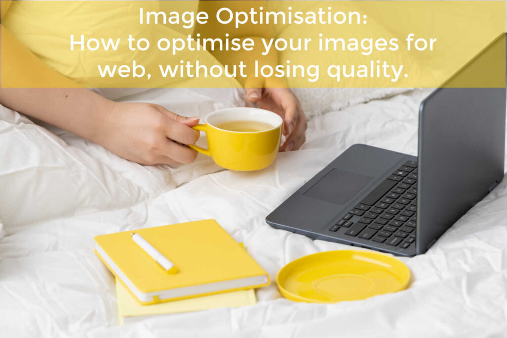
We all love a beautiful photo or stunning image that pops right off our screens. But did you know uploading a big, perfect image to a website can slow it down and affect your SEO in the process?
Websites have a lot of content and scripts to load, but when there are big, bulky images in the mix, it just adds to the load… unnecessarily.
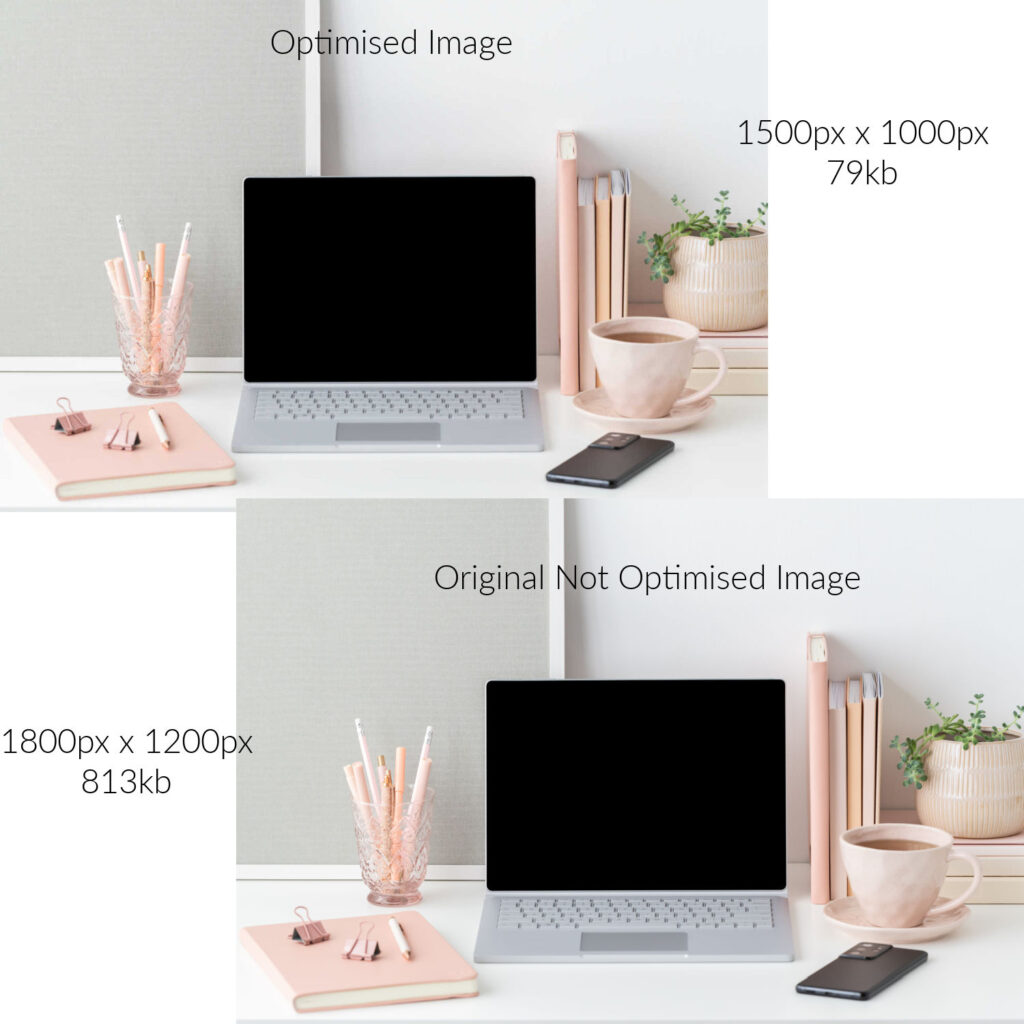
Think about it like this. You have a home page with 6 images on it. All your images were loaded straight from the camera, nice and big. They look great.
What you might not realise is each of those images is 2MB in size. As you have 6 images on your page, you are asking your website (and your website server) to load 12MB worth of images. That’s a heavy load.
When an image is optimised, it can be reduced to as little as 50KB without losing quality if done correctly and depending on the size of the image.
Now that your 6 images are a total of 400KB instead of the 12MB they were before, you’ve instantly saved your website a whole lot of time loading bloated images. Boom, your website speed improves and Google loves your site a whole lot more!
So how do we optimise images for a website without losing quality?
It’s really quite easy and we don’t need any fancy tools to do it. It’s just a matter of knowing what size image you need for the space on your site and where to go to optimise it.
The one thing I will point out, it is much easier to resize and optimise your images BEFORE you add them to your website media library. While there are plugins that can reduce image sizes and compress them, no free plugin will shrink your image from the 2MB / 4000px image down to a tidy 200KB / 1500px image.
Image sizes.
Most high res images are quite large in size. You might notice them having dimensions something like 4650px x 2540px (px = pixels. The unit of measure for measuring an image). For most websites, the largest image size you would need is no greater than 2000px. A full-width screen is 1920px, so anything over this size is unnecessary. All you’ll be doing is asking your website to shrink the image before it loads, again extra time and workload that you don’t need to add to your site. So work out where your image is going and then ascertain how big you think it needs to be.
For example:
If you are loading an image to be a full-width header on your website, then you might want it to be 1920px wide so it looks good on a full-width screen. Something smaller will lose quality as the screen expands. Images can reduce in size without losing quality, but not increase. When images have to increase in size, that’s when they become pixelated.
If you are inserting an image into your website that is half the screen, then something that is 1200px to 1500px should be more than enough. Again, you can go larger than the space, but don’t go smaller. For product images, I usually don’t go higher than 800px x 800px as they can become weighty especially if you have a lot of products to load. Most of the time I find 600px x 600px to be enough.
Tip: A tip for uploading images in Woocommerce or an online shop, upload them as squares. This will give you a consistent display on your website as every image will be taking up the same amount of space and it won’t matter if your image is 600px or 800px as the ratios will always be the same. You can also apply this same method for rectangular images, just make sure your dimensions and ratios are exactly the same for every image.
Reducing your image weight.
Even though we’ve reduced the pixel size of our image, it still has some unneeded weight hidden behind it. Removing this bloat is called compressing your image.
Let’s say our original image started at 2MB in its high-resolution form. By resizing the image to 1500px for our website we reduced the weight to 600KB. Which is still very good and a big improvement on the original image. But we can go more than that.
Using a free tool like Tiny PNG, we can get that same image down to about 100KB or maybe even less. The difference in quality will be negligible to the naked eye, but our website will be supercharged.
Once you’ve compressed your image – which takes about 3 seconds – download it and then upload it to your website media library. Now that image is ready to be inserted into your web page.
Check out the video below to see how easy it really is.
Tools to resize your images.
I use a graphic program called PicMonkey. It’s a bit like Canva in that it has the ability to create graphics, images, logos, etc. but I find the image editing in PicMonkey to be a lot better than Canva. As both are paid apps, I choose PicMonkey Pro at $19 a month. For me, it pays for itself with the time I save resizing and compressing images in one fell swoop.
I’ve included a quick demo of PicMonkey resizing and compressing an image in action below.
Other free online image resizing tools include:
Adobe – Free Online Tool
BeFunky
Free Image Resizer – Shopify
So there you have it. How to optimise your images for your website quickly and easily and all without spending a cent if you don’t want to. When it comes to your website, every second of speed and every Google ranking counts – and so do your images.
Belinda Owen is a WordPress Website Designer based in Brisbane but has clients all over Australia – the beauty of the online world! Belinda specialises in working with women in business who operate service-based businesses – either just starting out or already established – and has a passion for working with business start-ups. She also conducts website training and workshops and loves to share her knowledge and experiences with others – especially anything to do with WordPress and websites. As a non-techy person herself, Belinda has a knack for being able to explain things in a non-techy way – perfect for business owners who just want to get things done without being confused by terms like PHP or CSS! Belinda ensures her website builds are built to be edited with easy navigation for both customer and site owner – because there’s nothing worse than not even being able to change your phone number.